Before I start listing out some of my favorite font resources I want to give a little introduction to fonts and how to use them:
- If you have a brand guide that includes font usage directions, make sure to follow those.
- If you don’t have a brand guide or a brand font, you need to choose one. (I’d be happy to help you choose one if you don’t have a designer in your church who can help you find the right one for your brand. Shoot me an email at [email protected])
- There are different kinds of fonts that are designed for different uses:
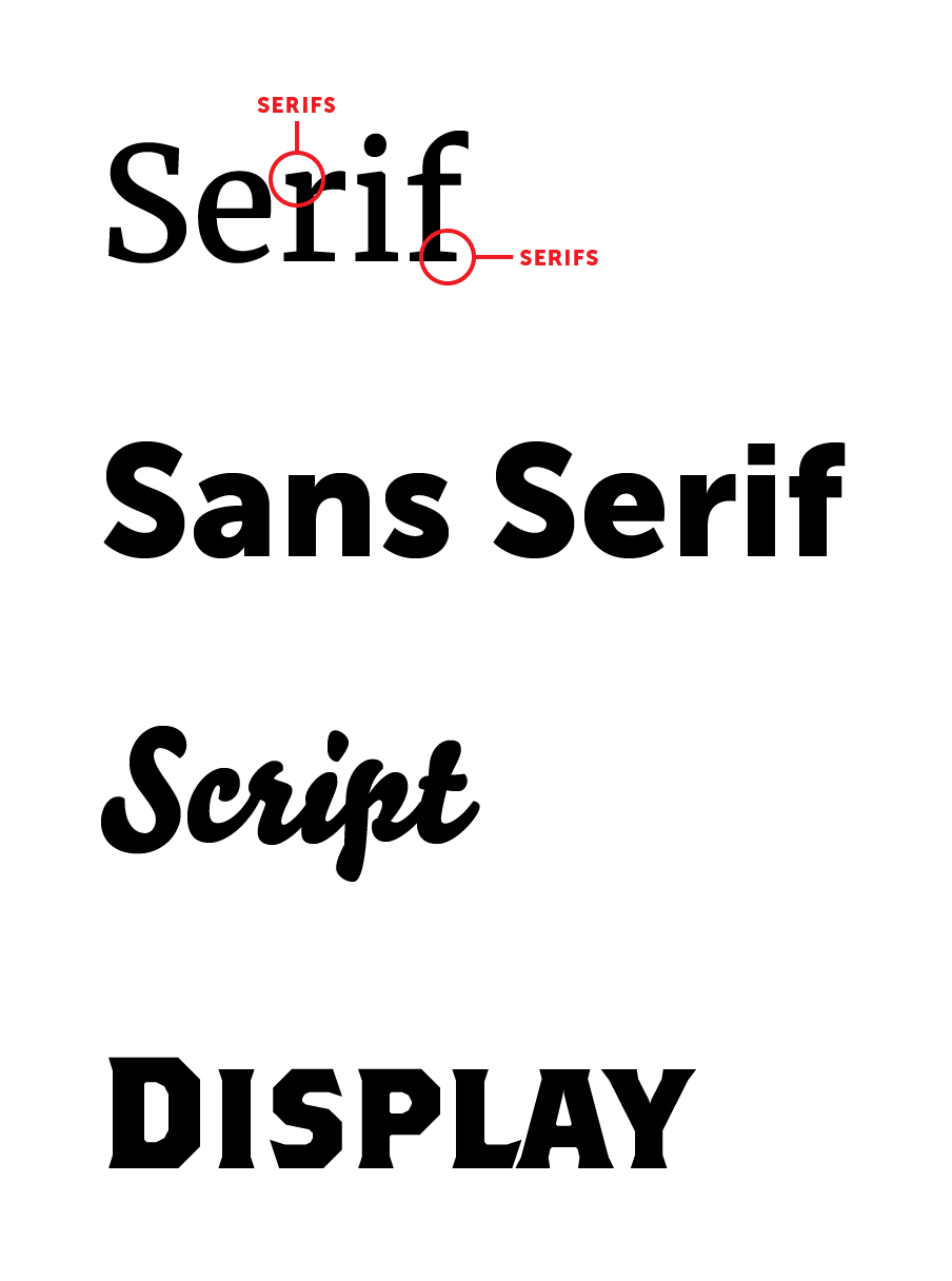
- Serifs
- Seriffed fonts (with their feet) tend to feel more traditional and formal.
- They are great for many things. They are highly readable and therefore are great for long text such as articles and documents.
- Some Serif fonts also look great at large sizes and therefore can make for great headers too.
- Sans Serif
- Sans serifs feel more modern and clean.
- Sans serifs are also very readable and work well for long text—though for very long texts like books, serifs are generally a little better.
- Script
- Scripts and handwritten looking fonts are great for titles, headings, logos, and other short textual design elements.
- Scripts are not made for readability (though some are more readable than others) but they would not be good for use on text longer than a few words. Even a full sentence is pushing it.
- Display (or Decorative)
- Again, these fonts are designed specifically for titles, headings, logos and other short text elements.
- There are wide variety of fonts that would fall under this category, and so the length of text recommended for use with these fonts varies greatly depending on the readability of the specific font. But certainly these fonts are not intended for long-form text.
- Font Families and how to use them
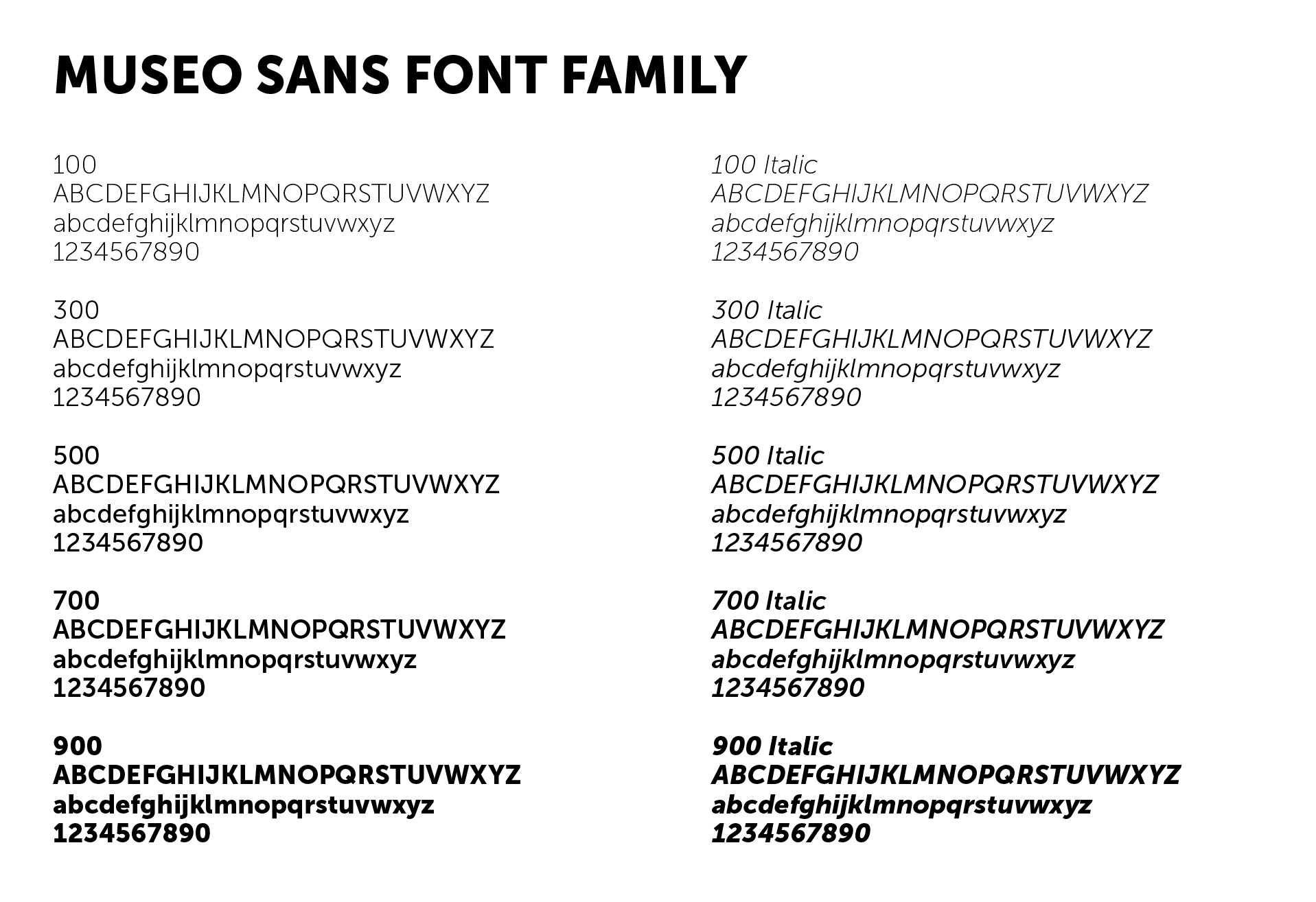
- Many fonts will come with a wide range of weights and styles. Above is an example of all the weights and styles of our church’s brand font, and many good fonts come with alternative styles and wide and narrow versions as well.
- My recommendation is to pick 2-3 weights and use those. Within the Museo Sans family, we use 500 as our standard weights and 900 as our bold and then every once in a while I use the 700 as a semi-bold and the lighter weights at larger sizes in titles or other short text elements.
- If you are using Microsoft office products you should not use the little bold and italic buttons. These buttons actually try to add weight to the font automatically (and its looks bad) rather than using the other styles within the font family. So you need to go into the font menu and select the different weights and styles manually.
- Use italics for emphasis, not all-caps or bolds or highlights or underlines etc. It looks much cleaner and keeps readers from feeling like your yelling at them.
- Learn more about fonts by watching season 2, episode 6 of Abstract on Netflix and this documentary on typography called Helvetica on Amazon.
- Lastly, there are a ton of fonts out there that are total garbage. And as a general rule you get what you pay for. There are some good free font resources that I will mention below, however, be wary of just downloading free (or even cheap) fonts from wherever you want—they are likely not very well designed fonts.
Font Resources
Now, the moment you’ve been waiting for here are some great font resources for you to explore! With all of these font resources, make sure to take a look at the licensing agreements and follow them! We as the church should not steal the work of font designers—designing fonts is time consuming stuff and we need to set an example of treating artists in love and respect by making sure we are not taking advantage of them.
Free
- Google Fonts – A few of my favorite Google Fonts listed below
- Merriweather – a great serif font with a lot of weights
- Oswald – A condensed sans serif with a lot of weights
- Open Sans – a versatile sans serif
- Pacifico – A fun script font
- Adobe Fonts
- If you already subscribe to the creative cloud suite from Adobe, you already have access to all these great fonts. The only downside with these fonts is that you can only use them in the Adobe programs, you can’t access them in Microsoft Office or other software.
- Lost Type Co.
- Lots of fun fonts!
- I probably wouldn’t recommend finding your workhorse brand font (serifs and sans serifs) here, these are more for fun one-off/event/sermon graphic designs.
- Behance
- Behance is actually a design portfolio site, but lots of people who design fonts will post fonts on there for free downloads—sometimes just a sample and sometimes full font families.
- Again I wouldn’t recommend getting your workhorse brand font (serifs and sans serifs) here.
Cheap
- Myfonts – You can spend more or less on fonts here—again, as a general rule, you get what you pay for.
- Creative Market – Lots of cheap fonts here—mostly scripts and display fonts. I wouldn’t recommend buying your workhorse brand font (serifs and sans serifs) here either.
Investments
These fonts are the kinds of fonts you will spend good money on, but you’ll use them for a long time
- Hoefler & Co. Fonts
- Any of these fonts would be a great investment, but in particular, Gotham, Knockout, Tungsten, Mercury and Sentinel are great fonts that will be highly useful for many years to come.
- Monotype
- Helvetica — the most universally loved and hated Sans serif. I love it. And it’s a great workhorse of a font. There’s lots of weights, widths sizes and styles.
- There’s other great classic fonts here as well.
Have fun and again, don’t hesitate to reach out and ask me more questions about typography — its one of my favorite subjects!